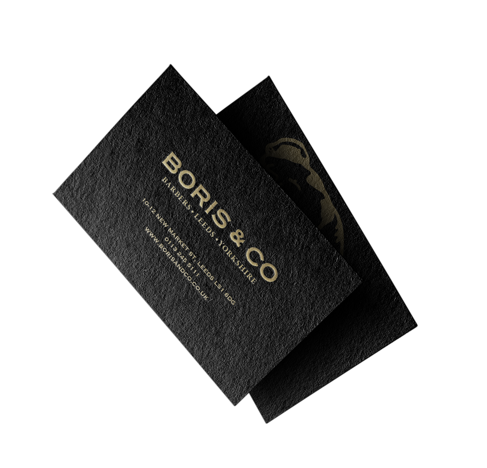
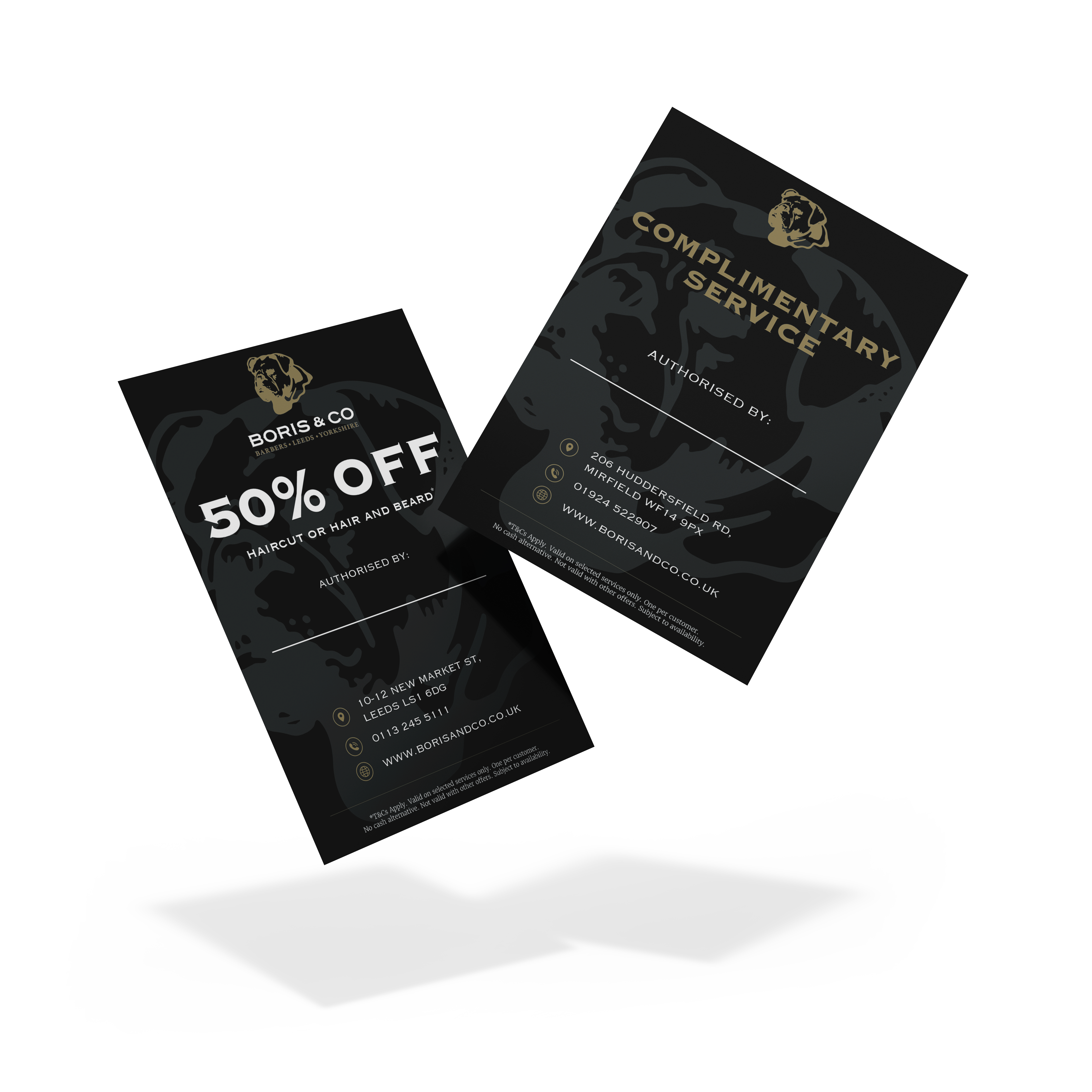
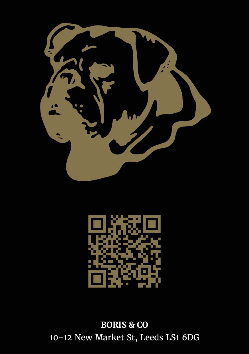
Boris & Co required a set of premium promotional materials to support in-store marketing and client retention across their Leeds and Mirfield locations. The brief focused on creating high-end business cards and promotional flyers that reflected the brand’s luxury barbershop identity, while clearly communicating special offers and booking information.
The core objective was to balance strong visual impact with practical functionality for everyday use by staff.
I began by reinforcing Boris & Co’s existing visual identity through a restrained colour palette of matte black and metallic gold. This immediately positioned the materials as premium and consistent with the in-store experience.
Typography and spacing were carefully considered to ensure clarity, while still allowing the designs to feel refined and understated. The layouts were structured to highlight the offer first, followed by supporting information and booking details.
To improve usability, dedicated space was incorporated for staff authorisation and handwritten names, ensuring the cards functioned effectively as both promotional and personal referral tools.
QR codes were also integrated into selected designs to provide a direct route to online booking and improve customer conversion.
I created the album artwork for two releases by Chimp in a Box, a thrash metal band with a chaotic, high-energy sound. Each design was crafted to reflect the intensity and themes of the music while pushing a bold, illustrative style.
Both covers were designed to be visually confrontational and emotionally direct—just like the music. I leaned into expressive illustration, bold colour theory, and a gritty visual language to give each album a strong, standalone identity that still ties into the band’s broader aesthetic.
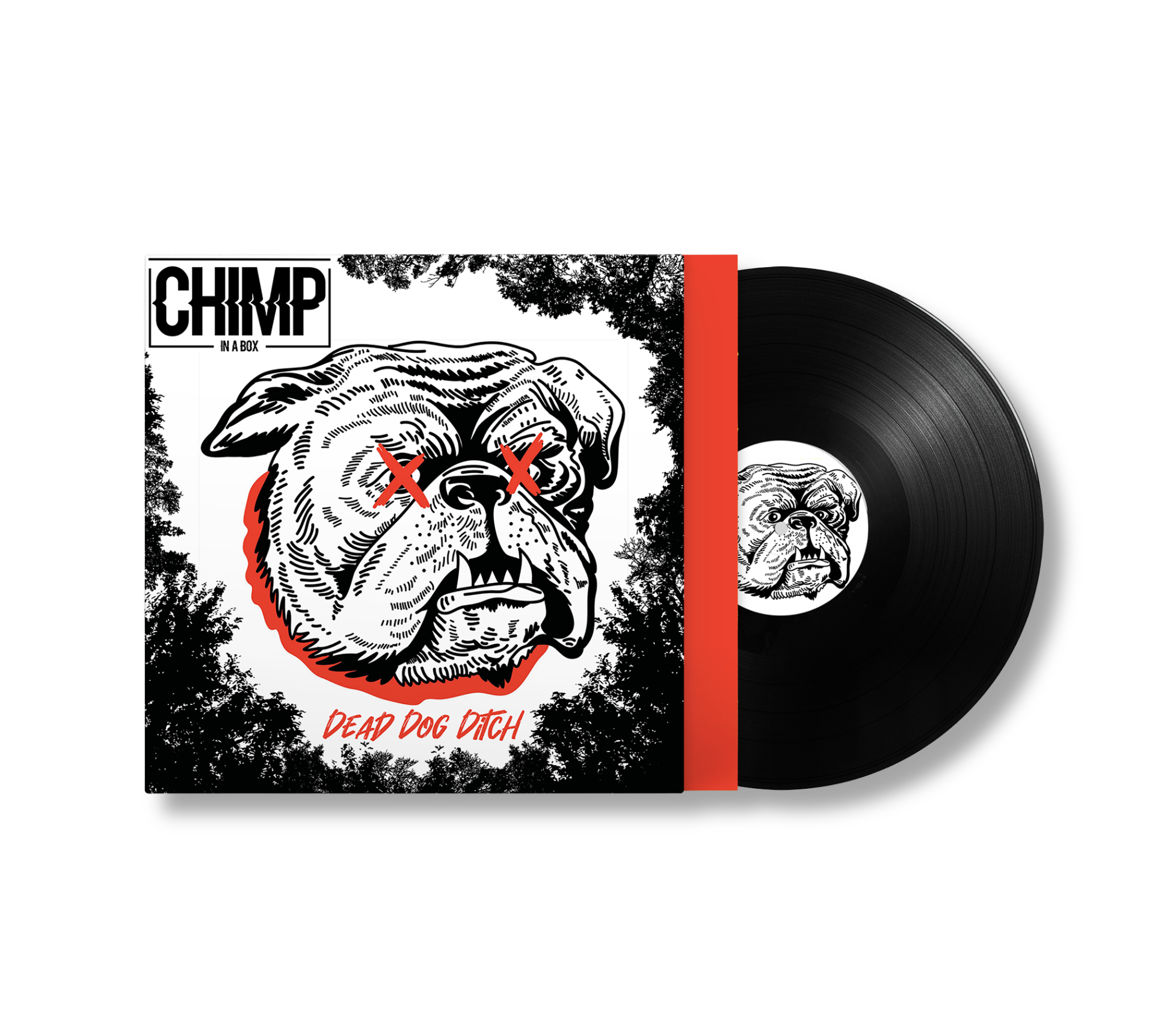
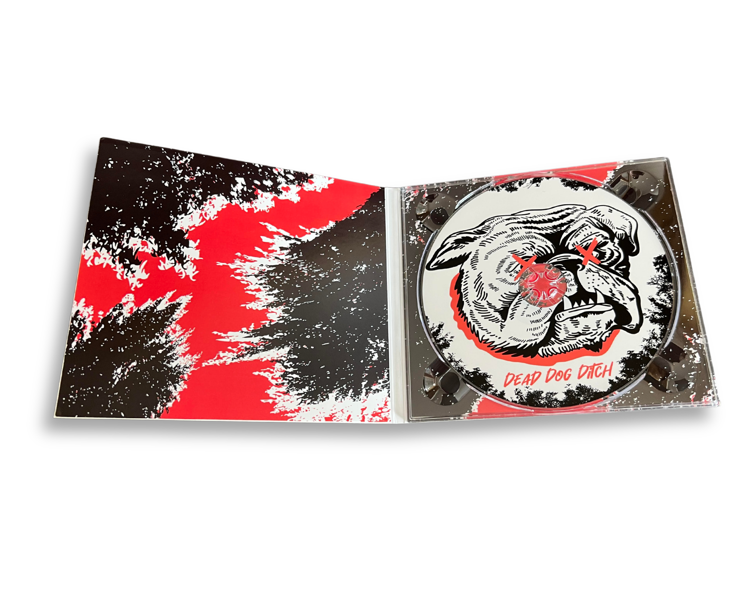
I designed the cover for Dead Dog Ditch to be loud, visceral, and visually confrontational, reflecting the raw energy of Chimp in a Box’s thrash metal sound.
At the centre is a snarling bulldog with exaggerated features and bold red X’s over its eyes; an image that’s both absurd and unsettling. I framed it with dense, high-contrast black foliage to create a feeling of claustrophobia and tension. The illustration style pulls heavily from old punk fanzines, raw, ink-heavy, and proudly lo-fi, embracing imperfection as a deliberate aesthetic choice.
The red accents and hand-scrawled title add urgency and aggression, while the stripped-back palette makes the design instantly bold and effective across physical formats like vinyl and merch.
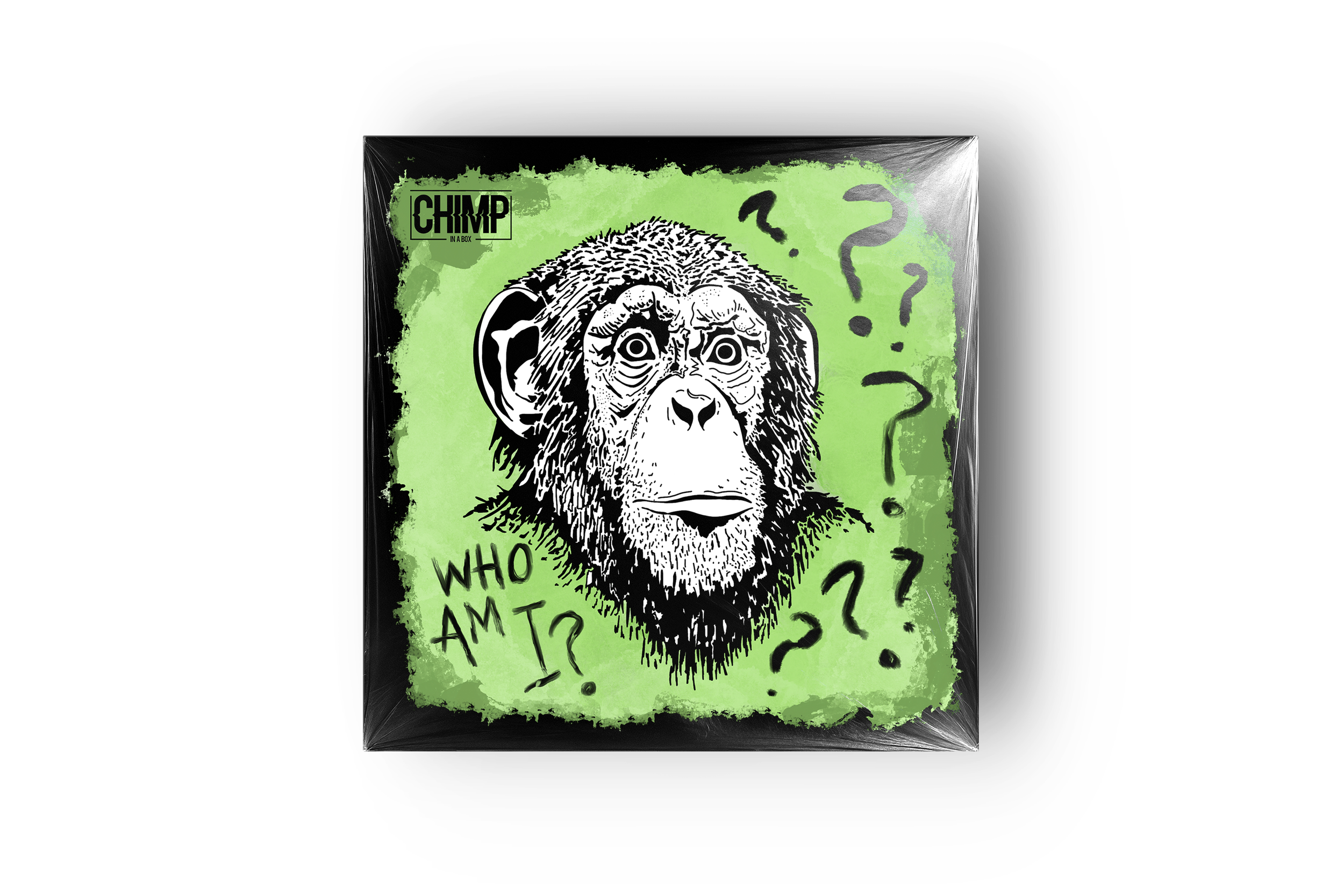
For Who Am I?, the artwork features a stark black-and-white sketch of a chimpanzee, wide-eyed and uncertain, set against a raw, acid-green background.
The scattered question marks reinforce a sense of confusion and psychological unrest, tying directly into the album’s existential tone. I chose the harsh green not just for visual impact, but to evoke instability and unease.
The rough textures and expressive linework give it a distressed, handmade feel, visually echoing the tension and introspection in the music.
I was approached by tattoo artist Charlie Edwards to help him develop a clothing brand from the ground up under the name “The Ravens Retreat”.
The centerpiece of the design is a sword design which Charlie was very keen to use, it was chosen to resonate with his audience and reflect the bold, edgy aesthetic associated with tattoo culture.
Working closely with Charlie, I crafted the visual identity to align with both his personal style and the brand’s narrative, ensuring the look feels authentic, cohesive, and engaging.
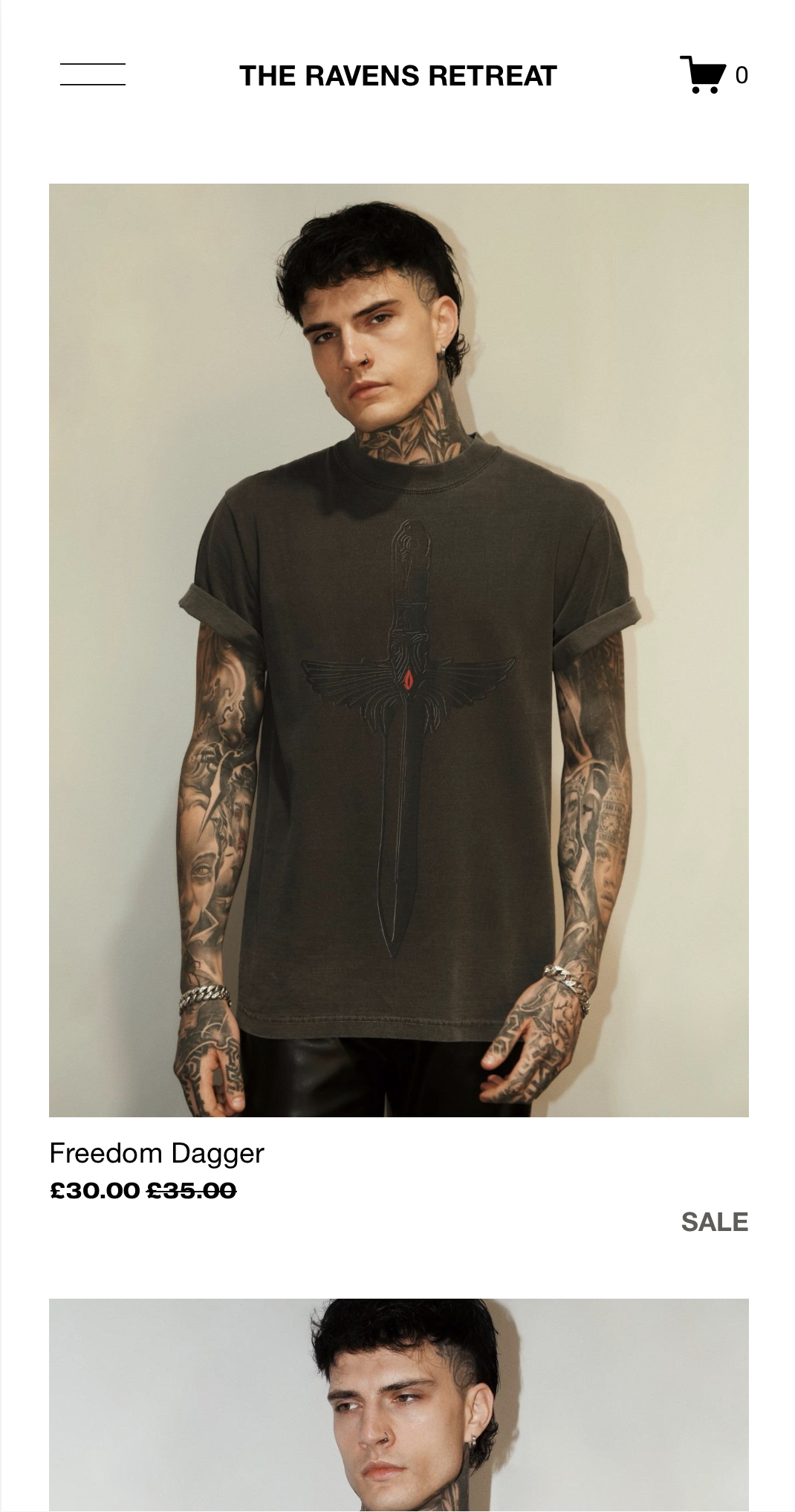
For The Ravens Retreat, I drew inspiration from a mix of streetwear influences, balancing both minimalist and maximalist design styles. This approach allowed some concepts to remain clean and understated, while others became more intricate and detailed. Working with Charlie’s vision of incorporating elemental themes into different sword variations, we explored a range of bold and unique motifs. I also infused Gothic and Medieval influences into the collection, reflected in elements like the “C” sigil, the large “EDWARDZ” design in a custom-designed font.
By keeping the colour palette limited, I ensured the artwork could be applied seamlessly across multiple clothing pieces, maintaining a cohesive brand identity.
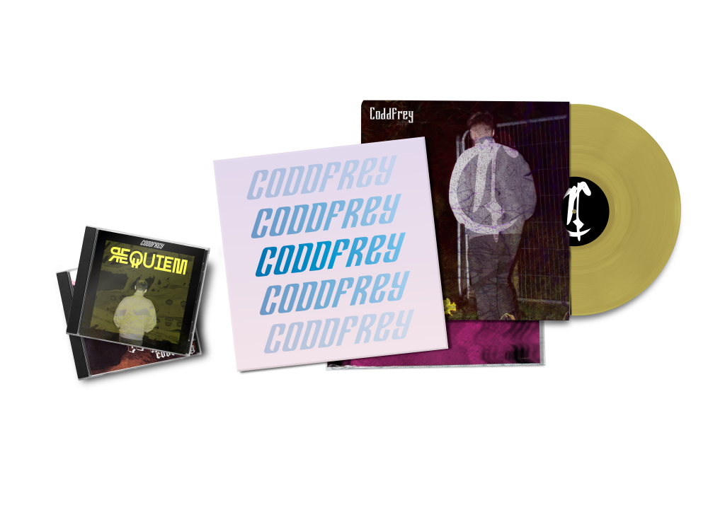
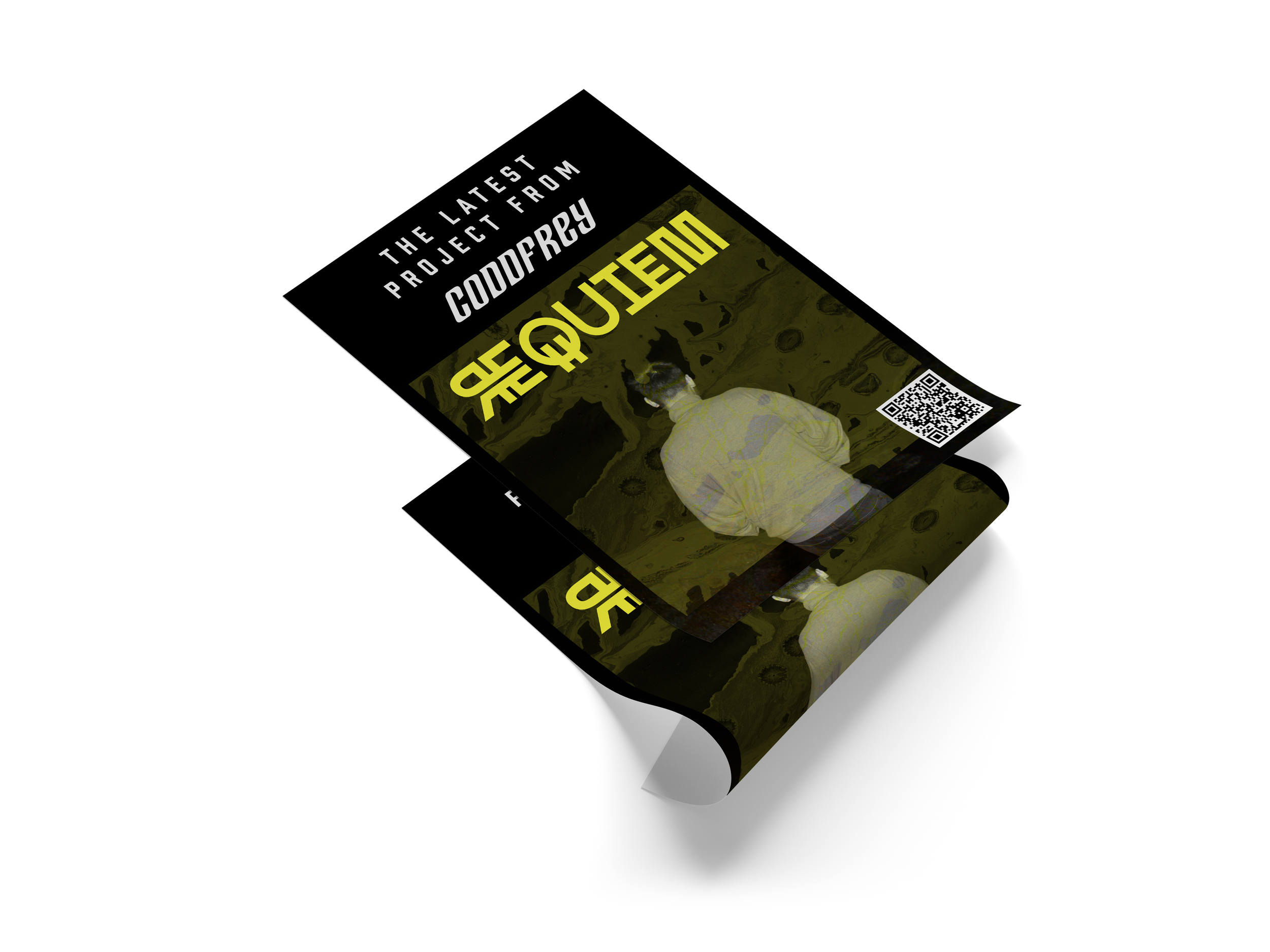
I’ve created artwork and merchandise for the musician Coddfrey, including album covers, physical releases, posters, and other visual material.
The projects span a range of tones and styles, often leaning into the experimental and electronic nature of the music, with each design aiming to reflect the mood and identity of the release.
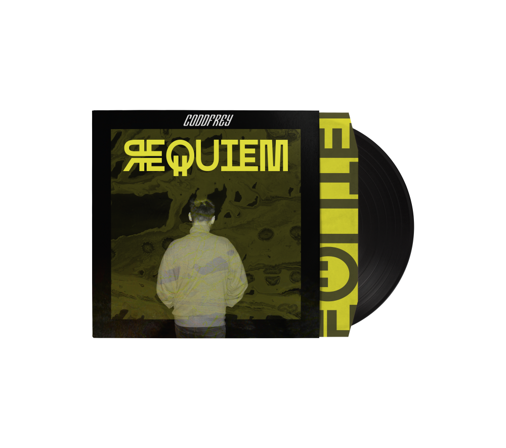
This is the cover I designed for REQUIEM, an experimental EDM release by Coddfrey. I wanted the artwork to feel heavy and introspective, like the music itself; dark, distant, and a bit unsettling.
I built the background using layered textures and light distortion to give it atmosphere and depth, while keeping it abstract and open-ended
Colour was key. I went with a muted green-yellow to cut through the greyscale and give everything a slightly toxic, synthetic edge. It’s meant to feel a little off, but still controlled. The whole design is minimal, focused, and intentional, letting the tone of the music come through without spelling it out.
I took this photo for Coddfrey’s (also known as Coddy) project “Trapped in Paradise” .
It was shot in a narrow brick alley, a place that instantly felt a bit claustrophobic and boxed-in. That mood really matched the theme of the album, so I wanted to build on it visually.
After getting the shot, I edited the window in the door to show this warped, colourful swirl; something that feels cosmic, maybe even a bit like heaven. It’s not a real place, more like an imagined version of paradise. I liked the idea of putting that kind of world just out of reach, right there through the door, but still completely inaccessible from the dark, closed-in space the person’s stuck in.
That contrast between the gritty, real environment and the surreal dreamscape outside was exactly what I was going for.
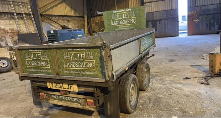
For this project, I created a clean and professional brand identity for LJF Landscaping, a local landscaping business. The goal was to reflect the company's hands-on, practical nature while still keeping the design fresh and approachable.
I designed two variations of the logo: one on a natural grass background to emphasize their outdoor services, and another with a bold gradient frame to give a modern, structured feel. Both versions feature custom tool icons to visually link the branding to the landscaping trade, and I used earthy tones and strong typography to give the logo balance, clarity, and visual impact.
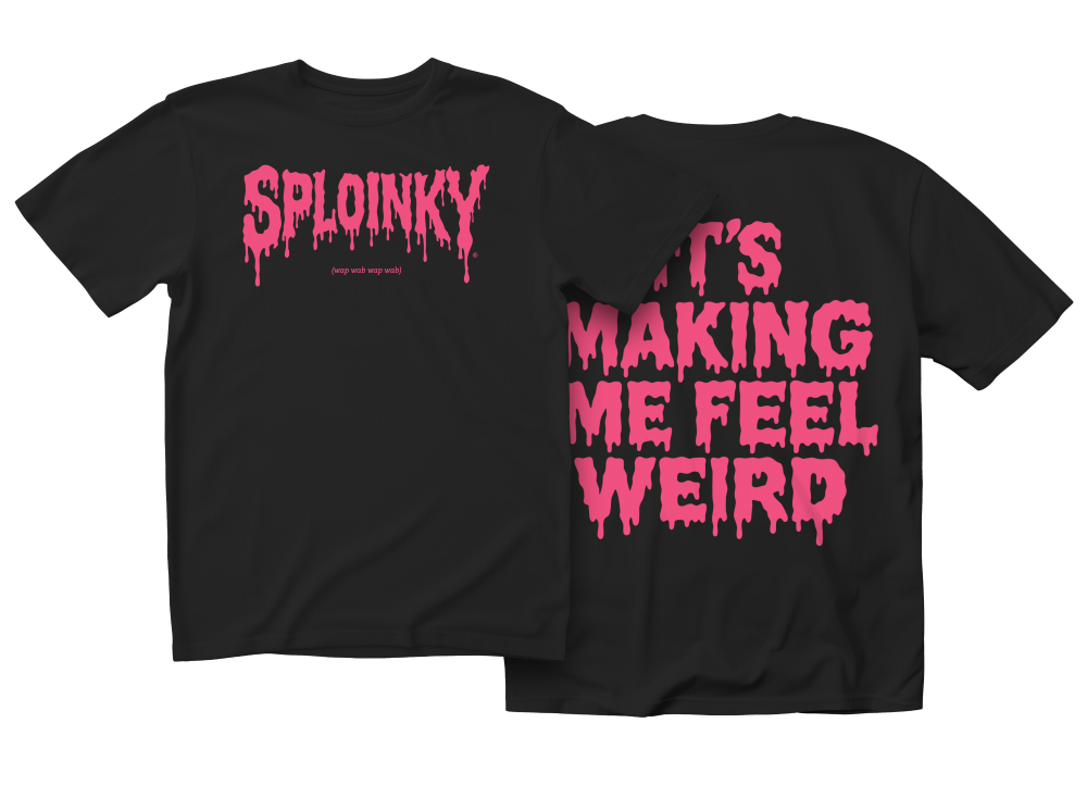
I was approached by TikTok creator “Grech,” who went viral for a video of him commentating in his car about “Sploinky Ass Music.” The clip caught the attention of DJ Subtronics, who remixed it into a track now played at multiple festivals. Grech wanted to create merchandise to capitalise on the momentum, with a design that resonated with the EDM scene and its audience. I designed a custom, hand-drawn font that I created on iPad with Procreate, featuring a slime-inspired style influenced by bold streetwear brands like Thrasher.
The merch has already received 250 pre-orders ahead of its mid-August launch.